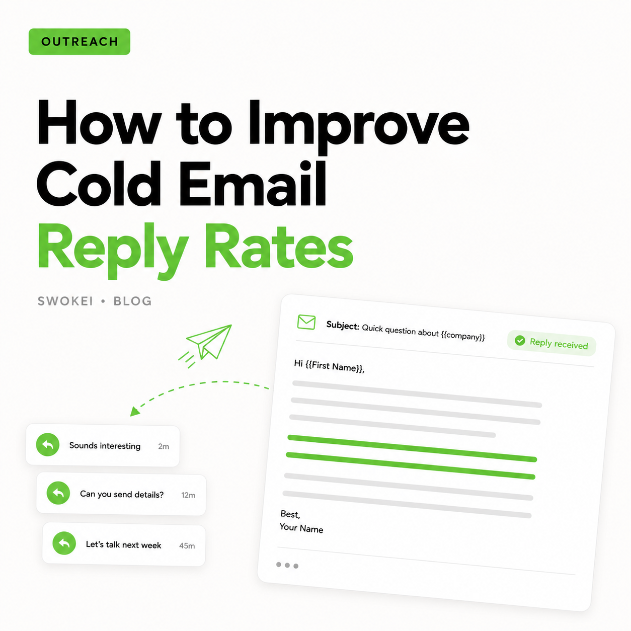
Most agency cold emails fail before the second line. Not because the service is bad, but because the message sounds copied, vague, and detached from the prospect’s actual site. Good ux audit cold email examples work for the opposite reason. They prove you looked, found something specific, and can explain why it matters in plain business terms.
If you sell redesigns, UX improvements, CRO work, or broader website rebuilds, your first email has one job: earn enough credibility to start a conversation. That usually means leading with one concrete observation, not a full teardown and not a generic pitch about “improving user experience”. The sweet spot is relevance with restraint.
What makes UX audit cold emails work
The strongest outreach emails are built on three things: a real issue, a clear consequence, and a low-friction next step. Miss one, and the email weakens fast.
A real issue means something visible and defensible. Maybe the mobile hero pushes the CTA below the fold. Maybe the pricing page takes too long to load. Maybe the nav gets crowded on smaller screens. These are stronger than soft claims like “your site could use some UX love” because they are concrete enough to feel honest.
A clear consequence is what turns an observation into a reason to reply. If the checkout flow creates hesitation, say that. If the page speed likely increases drop-off on mobile, say that. Prospects do not buy audits because you spotted a flaw. They reply because the flaw could be costing them leads, demos, or revenue.
The next step should stay light. Cold email is not the place to ask for a full discovery call with six stakeholders. Offer to send a few notes, record a quick teardown, or show two or three fixes worth testing. Lower commitment usually wins.
8 UX audit cold email examples
These examples are short on purpose. They are not meant to impress other marketers. They are meant to get a response from a busy operator, founder, or marketing lead.
1. The mobile issue opener
Subject: Quick UX note on your mobile homepage
Hi Sarah,
I checked your homepage on mobile and noticed the main CTA gets pushed well below the first screen because of the hero layout and stacked header elements.
That kind of friction can hurt demo bookings, especially from paid and branded traffic.
Happy to send over 3 quick UX fixes I’d test first if useful.
Best,
Why it works: it identifies one issue, ties it to conversion risk, and keeps the ask small. It also avoids pretending you ran a full audit when you only reviewed one page.
2. The speed-plus-UX angle
Subject: Noticed a conversion risk on your site
Hi Mark,
I ran a quick review of your site and saw the mobile load time on key pages feels heavy, especially before the first interaction.
When speed and layout friction hit together, users tend to bounce before they even reach the value prop.
If helpful, I can send a short audit with the main issues I spotted and a few practical fixes.
Best,
Why it works: speed alone can sound technical and abstract. Pairing it with user behavior makes the message more commercial.
3. The navigation friction email
Subject: Quick website observation
Hi Emily,
Your site looks strong visually, but I noticed the navigation gets crowded quickly, especially for first-time visitors trying to find service-specific pages.
That usually creates hesitation at the exact point where people are deciding whether to keep exploring or leave.
Want me to send a couple of UX notes on how I’d simplify the path?
Best,
Why it works: it opens with a balanced observation instead of going straight negative. That matters when prospecting into design-conscious teams.
4. The form-dropoff email
Subject: Small UX issue that may be costing leads
Hi James,
I took a look at your contact flow and noticed the form asks for quite a lot upfront, especially on mobile.
That kind of friction often reduces completion rates, even when traffic quality is solid.
I can send a brief breakdown of what I’d trim or restructure if that’s useful.
Best,
Why it works: forms are easy for prospects to understand because the business impact is obvious. It is also a safer angle than critiquing brand or aesthetics.
5. The homepage message mismatch
Subject: Quick thought on your homepage UX
Hi Anna,
I reviewed your homepage and the main issue I noticed was message hierarchy. The page introduces several ideas at once, so the core offer is easy to miss on first pass.
When that happens, even good traffic can struggle to orient fast enough to convert.
If you want, I can send a few notes on how I’d tighten the flow and CTA structure.
Best,
Why it works: many sites do not have obvious technical issues, but they do have clarity problems. This frames UX as communication, not just interface design.
6. The category-page email for ecommerce or multi-service sites
Subject: UX friction on your service pages
Hi Daniel,
I was looking through your service pages and noticed the page structure makes comparison harder than it should be. Important differences between offers are there, but they are buried.
That can slow decisions and push visitors back into research mode.
Happy to send a short audit with the main UX issues I found.
Best,
Why it works: it targets a common issue on larger sites where structure, not visual design, is the main problem.
7. The polite teardown offer
Subject: Recorded a few UX notes for your site
Hi Laura,
I spent a few minutes reviewing your site and spotted a couple of issues around mobile spacing, CTA visibility, and page flow that may be hurting conversions.
I haven’t recorded anything yet, but I’m happy to send a quick 5-minute teardown if you’d like to see what I mean.
Worth sharing?
Best,
Why it works: this format creates curiosity without overcommitting your team. It is especially useful when video audits convert well for your agency.
8. The highly specific observation
Subject: One fix I’d test on your pricing page
Hi Tom,
On your pricing page, the primary CTA competes with multiple secondary actions, and on smaller screens the visual hierarchy gets a bit muddy.
That usually weakens intent right before conversion.
If useful, I can send over the one change I’d test first and why.
Best,
Why it works: specificity beats breadth. One sharp point often gets more replies than a long list of issues.
How to adapt these UX audit cold email examples without sounding templated
The mistake most teams make is treating examples like copy-and-paste assets. Prospects can feel that immediately. The point is not to reuse the exact wording. The point is to reuse the structure.
Start with one issue you can defend in ten seconds. Then connect it to a likely business outcome. Then make a small offer. That formula holds up across SaaS, ecommerce, professional services, and B2B lead generation sites.
It also helps to match the issue to the buyer. A founder may care about conversion leakage and first impressions. A marketing lead may care more about campaign efficiency, page speed, and landing page performance. A product or digital lead may respond better to consistency, hierarchy, and mobile usability. Same site, different angle.
This is where a lot of outreach underperforms. The audit note may be good, but the framing is off. If you call out a design flaw without explaining the commercial effect, it can sound subjective. If you go too hard on revenue impact without enough evidence, it can sound inflated. Good outreach stays in the middle.
Common mistakes in UX audit outreach
The biggest one is over-auditing. Sending a 14-point teardown in the first email feels generous, but it often lowers reply rates. It creates homework. It also gives away too much before the prospect has shown any interest.
Another mistake is being too harsh. If your email reads like a public site roast, expect defensiveness. You are trying to start a sales conversation, not win a critique. Precise and respectful beats clever.
Then there is fake specificity. Saying “I noticed several UX and performance issues” is not specific. Neither is “your site could convert better”. Real specificity names the page, the element, or the user flow. That is what makes personalization believable.
Finally, many teams ask for too much too soon. A cold prospect is unlikely to book a full strategy call because of a single email. Asking permission to share notes, a short audit, or a quick teardown is usually the better move.
A simple framework for writing your own
Use this in plain English: I noticed X. This may be causing Y. Want me to send Z?
For example: I noticed your mobile menu pushes key category links below the fold. That may be making product discovery slower for first-time visitors. Want me to send a few ideas to tighten it up?
That is enough. You do not need inflated claims, manufactured urgency, or a paragraph about your agency’s credentials in every first touch. Relevance does the heavy lifting.
If your team is sending outreach at scale, the challenge is keeping this level of specificity without turning manual research into a bottleneck. That is exactly where platforms like Swokei fit: turning real site flaws into personalized outreach much faster, with 20 free credits and no credit card required.
The strongest cold emails do not try to sound brilliant. They sound observant, credible, and easy to respond to.