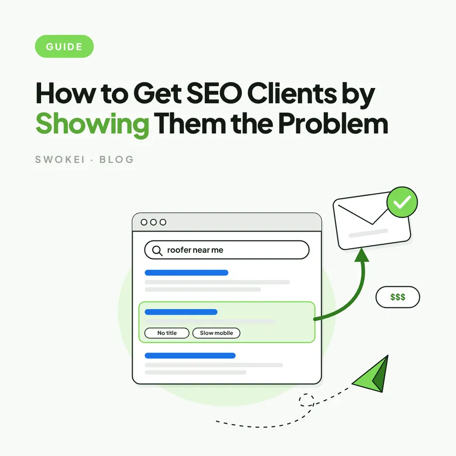
A dated website and a website that is costing its owner business are two different prospects, and only the second one tends to reply. Most agencies hunting for websites that need a redesign sort by taste: an old typeface, stock photography, a homepage slider from years ago. Taste is a weak filter, because what looks tired to a designer often looks established to the owner who paid for it. The filter that works is evidence of commercial friction that a stranger can see from outside and the owner can confirm on their own phone in ten seconds.
That shift changes everything downstream. A list built on looks produces emails that say the site could use a refresh, and those get deleted unread. A list built on evidence produces emails that name a 6.8 second mobile load on the booking page or a quote form that never confirms it was sent, and those get read. What follows covers which signals to look for, how to rank them, how to qualify the business behind the site, and how to do all of it fast enough to feed a weekly pipeline.
What makes websites that need a redesign worth contacting
A real redesign lead sits where two conditions meet. The first is functional weakness: poor mobile behaviour, slow pages, broken layouts, buried calls to action, confusing navigation. The second is commercial exposure, meaning the company relies on its site to win trust, enquiries, bookings or sales. When both are present the outreach has teeth, and when only one is present it is guesswork dressed up as research.
Consider two prospects. A local law firm has a plain site with an old typeface, but it loads in two seconds, works cleanly on a phone and books a consultation in two taps, so there is little urgency however dated it looks. A B2B software company has a modern homepage, yet its mobile layout shifts while loading, its demo button sits below three screens of animation and its pricing page takes five seconds to become usable. The second site looks newer and is the far stronger lead, because the friction is costing it pipeline right now.
Signals and triggers are not the same thing
A trigger is an event: a funding round, a new head of marketing, a third location opening. Triggers suggest a window, but they do not make a case, because a funded startup may spend its budget on paid ads and a new marketing lead may prefer to hire in-house. A signal is evidence of a problem on the live site today, something every visitor or search engine is already experiencing. The strongest prospects have both, and the email leads with the signal while the trigger explains why the timing matters.
Three tests every signal has to pass
A signal worth using is observable without access to the prospect's analytics, relevant to how this particular business makes money, and explainable in one sentence to someone who is not technical. An old colour palette is observable but subjective, so it fails the second and third tests. A mobile menu that will not open passes all three for any business whose customers search on their phones. When a finding fails a test, keep it for the sales call rather than the first email.
See what's wrong with any website in seconds
The free analysis checks speed, mobile and SEO, then shows what to say to the owner. No signup, no card.
The signals that show a site is costing its owner business
Some problems are visible in under a minute and others need a closer look. The categories below are the ones that hold up when the owner goes to check, which is the only standard that matters in cold outreach. Each one is strongest on the pages closest to revenue, so look at the service, pricing, booking and contact pages before the homepage footer.
Slow mobile pages close to the conversion
Speed is the most defensible signal because the data is public and the thresholds are published. Google's Core Web Vitals treat a Largest Contentful Paint under 2.5 seconds as good and anything over 4 seconds as poor, and a layout shift score above 0.1 means content moves after people start reading or tapping. A 7.3 second mobile load on a booking or quote page is a business problem, while the same number on an old blog post barely matters. The finding gets stronger with a visible cause attached, such as a 3,400px hero image, a page builder loading a dozen scripts, or a server response over 800 milliseconds that points at cheap hosting rather than the theme.
Checking this by hand on every prospect is slow, so run the URL through the free website analysis first and only open the site yourself when the numbers say there is something worth seeing. Treat a poor score as a prompt to look, not as proof on its own. Large sites sometimes carry heavy pages for good reasons, so prioritise cases where the slowness comes with obvious bloat, uncompressed media or intrusive third-party widgets.
Mobile layouts that are responsive in name only
Plenty of sites technically adapt to a phone and are still painful to use on one. Headlines wrap into five lines, tap targets sit closer than the 48 pixel minimum Google recommends, a chat widget covers the booking button, tables overflow sideways and the main call to action lands two screens below the fold. Pages that render at desktop width and force pinch-zooming are common on older themes and template builders that were never configured for small screens. These problems are valuable because they can be described in plain words and confirmed instantly, with no need to explain Core Web Vitals to anyone.
Conversion paths that break or disappear
Few findings are stronger than a contact form that fails to submit, a booking widget that never loads or a quote request with no confirmation state. If a business is sending 400 paid visitors a month to a form that errors out on iPhone Safari, its mobile conversion rate from that campaign is zero regardless of how good the ads are. Softer versions matter too: a homepage with no clear next step, service pages that end without a call to action, or a form demanding budget, timeline and company size before any trust is earned. Verify a broken path in more than one browser before mentioning it, and separate a persistent fault from a temporary third-party outage.
Trust gaps and visible neglect
Some of the best opportunities hide in plain sight: an expired SSL certificate that triggers a browser warning, mixed content that puts "Not Secure" in the address bar, a 404 in the main navigation, a copyright line five years old. Each one alone is minor, but together they say nobody inside the business is maintaining the site. Missing proof is the quieter version of the same problem, where a site asks for a booking or a quote without a single review, case study, certification or client name near the button. For professional services, healthcare, construction and premium local trades, that gap does credibility damage long before a sales call happens.
A site that tells an older version of the company
A redesign lead often appears when the business has moved on and the website has not. The company may have added a service line that is missing from the navigation, opened three new locations that all route to one generic contact form, or moved upmarket while the homepage still speaks to small buyers. These are high-intent cases because the pressure is organisational, and the owner usually feels the mismatch even if nobody has named it. Pair the change with the evidence: the expansion is the observation, and the location pages that dead-end in one form are the reason to reply.
How to rank signals before a single email is written
The fastest way to waste outreach volume is to treat every flaw as equal. Score each prospect on three things instead: impact, evidence and timing. Impact asks whether the problem sits on a conversion path or a trust-building page. Evidence asks whether it can be pointed to on a specific page with a specific behaviour or number. Timing asks whether there is a reason the business might care this quarter, such as a campaign, a rebrand, new locations or active hiring.
Under that scoring, a slow blog post with no commercial role scores low, and a slow mobile booking page for a clinic running paid search scores high. A dated homepage is moderate on its own, but a dated homepage that ignores a newly launched service while the company is hiring two salespeople is compelling. Every record that reaches the sending queue should carry enough proof to support one short, accurate opening line, so nobody has to invent relevance from a spreadsheet.
Why a cluster of findings beats a single one
No single signal is as persuasive as a cluster. A slow page alone might be a hosting plan already being changed, and an outdated plugin alone might be managed by a careful developer. A site with a 7 second mobile load, forty pages sharing one title tag, no call to action above the fold and a theme last updated four years ago tells a different story: neglect compounding across performance, search, conversion and infrastructure. Use the cluster to decide who to contact, then lead the email with the single strongest finding, because the depth of the diagnosis is the qualification and not the pitch.
Weighing up tools?
Honest comparisons with the tools agencies already use, including where they beat Swokei.
Qualifying the business, not just the website
A weak website does not make a buyer. Some of the worst sites belong to businesses that are tiny, inactive or not investing in growth, and they will admire the feedback and never move. Some average-looking sites belong to companies with budget, urgency and internal pressure to improve, and they are the better redesign opportunities even though the flaws are less dramatic. Qualification has to check both sides at once: a visible problem worth naming, and a business reason to act on it now.
Four checks do most of the work. Is the company visibly active, through recent hiring, fresh content, new locations or ads running? Is there a plausible budget fit, judged from team size, pricing, market position and brand maturity? Is there a timing reason, such as a launch, rebrand, merger or paid campaign pointing at weak landing pages? And is there an obvious owner for the problem, whether a founder embarrassed by the site, a marketing lead chasing conversion or a sales leader tired of thin inbound? A prospect that clears all four with a real site problem goes to the top of the list, and one with an ugly site but no movement gets parked.
Finding websites that need a redesign without wasting hours
Manual review produces excellent findings at a rate of perhaps three to five sites an hour, which is fine for ten target accounts and fatal for a weekly pipeline. Start narrower so fewer sites need inspecting at all. Pick sectors where the website carries obvious sales weight, such as clinics, law firms, home services, manufacturers, software companies and multi-location brands, then layer on business signals like active ad spend or marketing hires. The guide on automating prospect research covers how to build that list without hand-sorting it.
Then fix the signal set to the niche. Restaurants and clinics live or die on mobile booking and click-to-call, so blog freshness barely matters there, while B2B services and software buyers respond to trust, page clarity and conversion structure more than visual age. Choose three to five checks that keep showing up in the market, run them the same way on every URL, and only open a site personally when it clears the threshold. A comparison of redesign prospecting tools helps with the scanning layer, and teams moving off a pure list-building product can see where a ListKit alternative fits once site evidence is part of the workflow.
Turning the evidence into an email that gets a reply
Good prospecting makes the email simpler, not longer. Use one primary finding and at most one supporting observation, name the exact page and behaviour, state the likely consequence in proportion to the evidence, and ask a small question about whether that area is on the roadmap. A slow mobile booking page may be losing interested visitors, but nobody outside the business can say how much revenue it costs, and claiming a figure invites the owner to stop reading. Avoid stacking five flaws into a first touch, because it reads like an unsolicited audit and buries the one point that would have earned a reply.
The wording matters as much as the finding, and the guide to writing redesign emails covers the translation from audit notes to a short message. It also helps to know which website issues drive replies most often, since a correct finding that sounds like a design opinion still gets ignored. Before anything goes out, confirm the page is live and the problem shows up consistently, because a plain email with a real flaw beats a beautifully personalised one built on a mistake.
The agencies that win redesign work most consistently are not the ones sending the most email. They are the ones whose prospects think, on reading the first line, that someone actually looked at their site. To start building that list today, run the next prospect on the shortlist through the website analysis, pick the one finding closest to their revenue, and see whether it passes the three tests before writing a word.
Run it on a real site before your next pitch
Analyse a prospect's site for free, or start free and let Swokei write the email from what it finds.