Most cold outreach from agencies fails in the first five seconds. The prospect sees another vague pitch about "improving your website" and bins it because nothing in the email proves the sender actually looked.
That is the real problem with cold email for web designers. It is not that email is dead or prospects hate being contacted. It is that most outreach is generic, easy to ignore, and disconnected from anything commercially useful. If you sell redesigns, UX improvements, or website rebuilds, your edge is relevance. You should be able to show exactly what is wrong, why it matters, and why a conversation is worth having.
Why cold email for web designers usually underperforms
Web design agencies often assume the offer itself is enough. Better design, better UX, faster pages, stronger conversion flow - these are all valuable. But to a prospect, they are still claims. Without context, your message sounds like every other agency promising more leads and a nicer site.
The weak point is usually research. A proper website review takes time. You need to check mobile behaviour, page speed, messaging, layout consistency, trust signals, calls to action, and obvious UX friction. Do that manually across a large prospect list and your outbound process slows to a crawl. Skip the research and the email turns into spam.
That trade-off is where many teams get stuck. They want volume, but relevance takes effort. They want personalised outreach, but manual auditing does not scale well. So they settle for light personalisation like a first name and company name, which is not real personalisation at all.
What good outreach looks like
A strong cold email does one thing fast: it gives the prospect a reason to believe you noticed something worth fixing.
For web designers, that usually means pointing to a concrete issue on the site. Maybe the mobile hero pushes the primary call to action below the fold. Maybe the homepage loads slowly on mobile. Maybe the services page has weak visual hierarchy, inconsistent spacing, or outdated trust elements. These are specific observations, not generic opinions.
That specificity changes the tone of the email. Instead of sounding like a mass pitch, it reads like an informed prompt. The prospect may not agree with every detail, but they can see that the message is grounded in their actual website.
It also helps commercially. Design buyers do not pay for aesthetics alone. They pay when design problems affect conversion, trust, speed, usability, or sales efficiency. If your email connects a visible issue to a business outcome, you move the conversation from taste to value.
The anatomy of a cold email for web designers
The best-performing emails are usually short, direct, and built around one useful observation.
Your subject line should stay plain. Something like "Quick note on your mobile homepage" often works better than clever copy. Curiosity is fine, but clarity usually wins.
The opening line should prove the email is not generic. Mention the site and the issue you noticed. Do not overdo it with long audits in the first message. One or two relevant observations are enough.
The middle of the email should explain why the issue matters. This is where a lot of agencies miss. Saying "your site could use a redesign" is weak. Saying "your mobile page takes long enough to load that users are likely dropping before they reach your enquiry CTA" is stronger because it ties design to behaviour.
The close should make the next step easy. Ask a simple question. Offer to send a few more observations. Suggest a short call if they are already reviewing the site. Do not force a big commitment in the first touch.
Here is the underlying structure in plain terms: observed flaw, business impact, low-friction next step.
Personalisation that actually matters
There is a difference between decorative personalisation and persuasive personalisation.
Decorative personalisation says, "I saw your company is based in Chicago" or "Congrats on your recent post." It may show basic effort, but it rarely supports the service you are selling.
Persuasive personalisation is tied to your offer. It says, "Your booking form is hard to use on mobile" or "The page speed on key landing pages may be hurting paid traffic performance." That kind of detail makes your outreach feel relevant because it is relevant.
For agencies selling redesign work, the best personalisation usually falls into a few buckets: performance issues, mobile UX problems, conversion friction, outdated design patterns, weak content hierarchy, and trust gaps. You do not need to mention all of them. In fact, you should not. Pick the most obvious one and build the message around it.
There is also an important trade-off here. If your observation is too technical, non-technical buyers may tune out. If it is too broad, it loses credibility. The sweet spot is a visible issue with a clear commercial consequence.
Volume versus quality is the wrong debate
Agencies often talk about cold outreach as if they have to choose between sending fifty good emails or five thousand bad ones. That framing is outdated.
What actually matters is whether your process can produce credible observations at scale. If every email references a real website issue, volume stops being the enemy. You can reach more prospects without sacrificing relevance.
That is why the workflow matters more than the copy alone. Good cold email for web designers is not written in isolation. It starts with lead sourcing, then site analysis, then message generation, then campaign review. If one of those steps is weak, the whole system suffers.
This is where automation becomes useful, but only if it preserves substance. Automating generic lines is just faster spam. Automating website analysis and turning those findings into tailored outreach is different. That gives agencies leverage without stripping away the reason prospects reply.
How to improve reply rates without sounding salesy
A lot of design agencies overcompensate after hearing that generic cold email does not work. They make the message too long, too detailed, or too consultative. The result is still poor because the prospect is being asked to read a mini audit from a stranger.
Better outreach respects attention. Keep it tight. Lead with one issue, explain the impact in one line, and offer a light next step. You are not trying to close a redesign deal in the inbox. You are trying to earn enough interest for a reply.
Tone matters too. Avoid inflated promises and broad claims about doubling conversions unless you have a strong reason to say it. A more credible approach is to sound like someone who does this every day. Calm, specific, and commercially aware beats flashy every time.
Timing and segmentation also play a role. A local service business with an outdated site may respond to very visible UX flaws. A SaaS company may care more about conversion paths and speed. An ecommerce brand may care about mobile navigation and checkout friction. The same outreach framework applies, but the angle should match the business model.
A practical workflow agencies can actually run
If you want outbound to become a real pipeline channel, treat it like a system rather than a side task.
Start with a clear prospect segment. Do not email every business with a bad website. Focus on companies where your agency has a believable point of view and relevant case experience.
Then analyse the site for issues that are easy to explain and hard to dismiss. Prioritise problems visible on important pages, especially on mobile. Those usually create the strongest opening messages.
Write emails around the strongest single observation, not a laundry list. Send follow-ups that add value rather than repeating the same ask. If there is no response, a second note can mention another issue you spotted or reframe the business impact.
Finally, watch for patterns. Which flaws trigger replies? Which market segments engage? Which framing gets meetings instead of polite thanks? The agencies that get cold email working are not guessing forever. They tighten the process based on evidence.
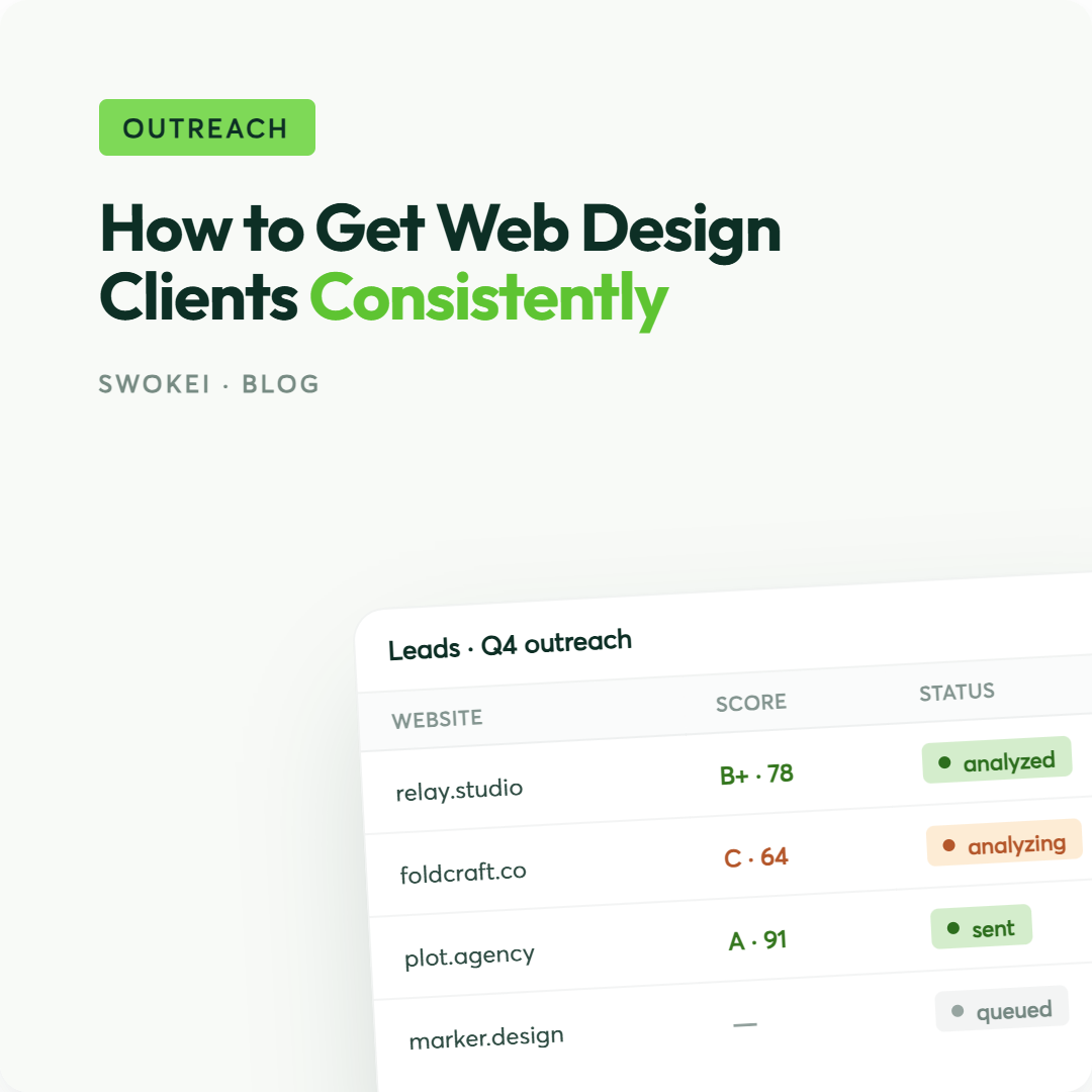
For teams that want to do this without sinking hours into manual reviews, Swokei helps turn website flaws into personalised outreach at scale. It analyses prospect sites, surfaces concrete issues, and prepares inbox-ready campaigns. You can test the workflow with 20 free credits, no credit card required.
Cold outreach gets much easier when you stop trying to sound impressive and start giving prospects a reason to care.